How to Enhance Photos for Social Media – Complete Guide for 2025
Want to enhance photos for social media and get more likes, comments and shares? Great visuals stop the scroll and grab attention in crowded feeds. Dull or poorly lit photos get ignored no matter how good your content actually is. The right enhancements make your images pop and stand out from thousands of other posts competing for viewer attention every single day.
Social media photo enhancement involves optimizing brightness, contrast and colors for digital screens. Each platform displays images differently and favors certain visual styles over others. Instagram loves vibrant saturated colors while LinkedIn prefers clean professional looks instead. Understanding these differences helps you enhance photos that perform well on your target platforms specifically.
According to Statista social media research, posts with high quality images receive 650 percent more engagement than text only content. That massive difference shows why photo enhancement matters so much for social media success. A few minutes of editing can dramatically increase how many people actually see and interact with your posts online.
Why Photo Quality Matters on Social Media Platforms
Social media algorithms favor content that keeps users engaged and scrolling longer. High quality images stop people from scrolling past your posts too quickly. When viewers pause on your content, algorithms notice and show it to more users. This creates a positive cycle where better photos reach bigger audiences naturally over time.
First impressions happen in less than one second on social feeds. Users decide whether to engage or scroll past based on visual appeal instantly. Blurry, dark or dull photos signal low quality content that most people skip without reading. Sharp, bright and colorful images suggest value worth exploring further. Your photos must earn attention before your message even gets a chance.
Brand perception forms through consistent visual quality across all your posts over time. Professional looking photos build trust and credibility with your audience gradually. Sloppy images make even great businesses look unprofessional or careless to potential customers. The visual standard you maintain shapes how people view your entire brand identity online.
Competition for attention has never been more intense on any social platform today. Millions of new posts appear every minute across Instagram, Facebook and other networks. Standing out requires visual quality that most amateur posts simply do not achieve naturally. Enhancement gives your content the edge needed to compete with professional creators and bigger brands effectively.
Mobile viewing dominates social media consumption with over 80 percent of users browsing on phones. Small screens make image quality problems more obvious and harder to ignore than desktop viewing. Dark shadows turn pure black and washed out highlights lose all detail on phone displays. Proper enhancement ensures your photos look great specifically on the devices most viewers actually use.
Best Enhancement Settings for Instagram Posts
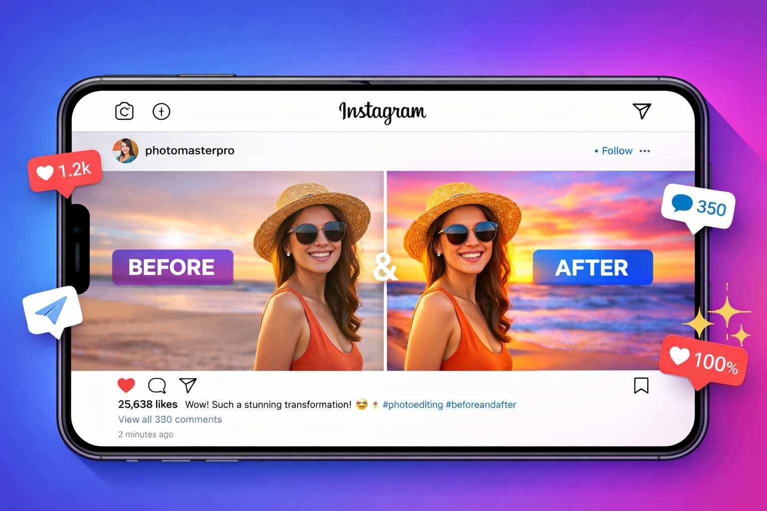
Instagram rewards visually striking content with broader reach through its algorithm design. The platform built its entire identity around beautiful photography and creative expression. Understanding what works best on Instagram helps you enhance photos that perform well here specifically. These settings create the Instagram aesthetic that users and algorithms both respond to positively.
Brightness should lift shadows without blowing out highlights too much. Instagram feeds display against white backgrounds that make dark photos look heavy and out of place. Increase brightness by 10 to 20 percent so faces and subjects are clearly visible on mobile screens. Watch for pure white areas losing detail as you brighten though. The goal is visible shadow detail while keeping bright areas under control still.
Contrast adds the punch that makes Instagram photos pop against competing content nearby. Raise contrast by 15 to 25 percent to create depth and visual impact that grabs attention fast. This makes colors appear more vivid and subjects stand out from their backgrounds better. Too much contrast creates harsh unnatural looks so keep adjustments moderate rather than extreme always.
Saturation on Instagram tends toward the vibrant side compared to other platforms currently. Boosting colors by 10 to 20 percent makes photos more eye catching in the feed scroll experience. Food, travel and lifestyle content especially benefits from punchy saturated color treatments. Portraits need lighter touch though to avoid unnatural skin tones that look obviously edited badly.
Sharpness helps photos look crisp even after Instagram compresses them during upload processing. The platform reduces file sizes which can soften fine details in your original images somewhat. Adding 20 to 30 percent sharpening before upload compensates for this compression softening effect. Check results at full zoom to ensure you have not oversharpened and created ugly halo artifacts.
Our AI photo enhancer handles all these adjustments in one simple workflow. Auto enhancement applies balanced Instagram ready settings with just one click instantly. Manual sliders let you fine tune any parameter to match your specific visual style preferences. The before and after comparison shows exactly how much improvement your photos receive.
Optimizing Photos for Facebook and LinkedIn
Facebook and LinkedIn serve different audiences with different visual expectations than Instagram does. Business professionals on LinkedIn prefer clean understated imagery over flashy edited looks. Facebook spans casual personal posts to professional business content depending on context and audience. Matching your enhancement style to each platform improves how content performs there specifically.
Facebook compresses images more heavily than most other social platforms do. Starting with high quality source files helps compensate for this quality loss during upload. Enhance photos at full resolution before uploading rather than working with smaller versions first. Slight oversharpening of about 25 to 35 percent actually helps since Facebook softens images during processing anyway.
Brightness levels should make subjects clearly visible without extreme bright areas dominating shots. Facebook users browse feeds quickly and skip over dark hard to see images regularly. Lift shadows enough that facial features and important details are easily visible on mobile screens. Keep highlights controlled though since blown out whites look particularly bad on Facebook timelines.
Color saturation works best at natural or slightly enhanced levels for Facebook generally. The platform audience includes older demographics who often prefer more realistic looking imagery overall. Subtle saturation boosts of 5 to 15 percent add life without looking obviously processed or filtered. Food and product photos can go slightly higher while portraits should stay more natural always.
LinkedIn demands the most professional restrained visual treatment of major social platforms today. Subtle enhancements that improve quality without obvious editing work best for business content here. Keep saturation near natural levels and avoid dramatic contrast or color treatments entirely. Clean bright images that look professional and trustworthy perform best on this business focused network.
Headshots and professional portraits need special attention for LinkedIn profile and post use. Skin tones must look natural without orange casts from over saturation adjustments applied carelessly. Sharpening should enhance eye detail without emphasizing skin texture and pores too much harshly. Our photo enhancement tool lets you adjust each parameter separately for precise professional results.
Creating Eye Catching Thumbnails for Video Content
Video thumbnails are actually still images that benefit hugely from proper enhancement work. YouTube, TikTok and other video platforms show thumbnails before users decide whether to click and watch. A great video with a poor thumbnail gets far fewer views than it deserves to receive. Thumbnail enhancement can dramatically increase click through rates and video performance overall.
Thumbnails must communicate clearly at very small display sizes on various screens. Most viewers see thumbnails as small tiles among many competing options in browse views. Simple compositions with one clear focal point work better than busy cluttered images always. High contrast between subject and background ensures the main element stands out even when displayed tiny.
Brightness levels need to be higher than standard photo editing suggests typically. Dark thumbnails disappear against interface elements and competing bright content surrounding them. Increase brightness until subjects are clearly visible even when thumbnails display at minimal sizes. Test how your thumbnails look when shrunk down to actual display dimensions before finalizing edits.
Color saturation can go higher for thumbnails than normal photos without looking overdone actually. The small display size reduces how obvious editing appears to casual viewers scrolling past. Vibrant colors grab attention better than muted natural tones in competitive browse environments. Push saturation 20 to 30 percent higher than you would for standard photo sharing purposes.
Sharpness is critical since compression and small display sizes both soften fine details significantly. Apply strong sharpening of 35 to 50 percent so text and faces remain clear at thumbnail sizes. Check for oversharpening artifacts at full size but prioritize clarity at actual display dimensions primarily. Our image resize tool helps you preview how thumbnails look at their actual display sizes.
Text overlays on thumbnails need enhancement attention beyond just the photo itself also. Ensure text remains readable by maintaining strong contrast against background colors behind letters. Avoid placing text over busy areas where it competes with background detail for viewer attention. Simple bold text with outline or shadow effects stays readable across all thumbnail viewing conditions reliably.
Platform Specific Image Size Requirements
Each social platform has ideal image dimensions that display best in their unique feed layouts. Uploading wrong sizes results in awkward cropping or quality loss from forced resizing by platforms. Knowing correct dimensions before enhancing saves time and produces better final results consistently. Start with proper sizes so enhancement work is not wasted on poorly formatted images later.
Instagram supports multiple formats with different ideal dimensions for each one. Square posts work best at 1080 by 1080 pixels for maximum quality on all devices. Portrait posts should be 1080 by 1350 pixels to fill more screen space in feeds advantageously. Stories and reels need 1080 by 1920 pixel vertical format to display full screen on mobile phones properly.
Facebook feed posts display best at 1200 by 630 pixels for link previews and standard posts. Square format at 1200 by 1200 pixels also works well for certain content types on Facebook feeds. Cover photos need 820 by 312 pixels on desktop but display differently on mobile device screens too. Profile pictures should be at least 180 by 180 pixels but 320 by 320 provides better quality results.
LinkedIn recommends 1200 by 627 pixels for standard feed posts shared with your professional network. Company page banners need 1128 by 191 pixels while personal profile banners are 1584 by 396 instead. These business focused dimensions reflect the platform's preference for horizontal professional style imagery overall. Square images work too but horizontal performs better statistically on this platform specifically.
Twitter or X displays images best at 1600 by 900 pixels in the 16 by 9 aspect ratio horizontal format. In stream photos display at 1200 by 675 pixels within the standard tweet card format area. Header images need 1500 by 500 pixels to display correctly across different device screen sizes consistently. Profile pictures display in circles so square images of 400 by 400 pixels work best for clarity.
Our resize image online tool makes hitting these exact dimensions easy and fast. Resize after enhancement to preserve quality improvements in your properly sized final files. Wrong dimensions waste enhancement effort when platforms crop or compress images badly during upload processing.
Quick Enhancement Workflow for Busy Content Creators
Content creators managing multiple platforms need fast efficient workflows that produce consistent results reliably. Spending hours editing every single image is not practical when you post content daily or more frequently. A streamlined process lets you enhance many photos quickly without sacrificing quality standards noticeably. These workflow tips maximize results while minimizing time investment required.
Start every enhancement session by trying auto mode first before manual adjustments. AI powered auto enhancement handles most common problems well on its own automatically. Only switch to manual controls when auto results need specific tweaks beyond balanced improvements. This approach saves time on photos that enhance well automatically while preserving control when needed specifically.
Develop standard settings that work for your content type and stick with them consistently over time. If your photos typically need similar adjustments, remember those values for quick repeated application. Portraits might always need a specific brightness and saturation combination that works well together. Product photos may consistently benefit from particular contrast and sharpness levels applied each time.
Batch similar photos together in your workflow to speed up the enhancement process significantly. Enhance all your Instagram posts first with Instagram optimized settings applied consistently throughout. Then switch to LinkedIn settings for professional content rather than jumping between platforms constantly. This focused approach is much faster than context switching between different enhancement goals repeatedly.
Use keyboard shortcuts and workflow automations wherever your tools support them for speed. Learning shortcuts saves seconds per photo that add up to hours over weeks of regular content creation work. Browser based tools like our AI photo enhancer work instantly without software loading delays slowing you down constantly.
Create a quality check step before exporting final images to catch problems early efficiently. Zoom to full size and scan for oversharpening halos, noise amplification or color problems quickly. Compare enhanced versions against originals to verify improvements actually happened as intended correctly. Five seconds of checking prevents sharing poorly enhanced images that hurt your brand appearance publicly.
Color Psychology for Social Media Engagement
Colors trigger emotional responses that influence how viewers react to your social media content subconsciously. Understanding color psychology helps you enhance photos for maximum emotional impact on audiences. Different colors work better for different content goals and target audience demographics specifically. Strategic color enhancement can significantly improve engagement beyond just making photos look nicer technically.
Warm colors like red, orange and yellow grab attention and create excitement quickly. These colors work great for calls to action, sale announcements and energy focused content themes. Food photography especially benefits from warm tones that make dishes look appetizing and delicious to viewers. Boost warm tones slightly during enhancement when you want viewers to feel energized or hungry specifically.
Cool colors like blue and green create calm, trustworthy, professional impressions on viewers instead. These colors work well for finance, healthcare, technology and professional service content generally. Landscapes and nature photos often benefit from enhanced cool tones that feel peaceful and refreshing emotionally. LinkedIn content typically performs better with cooler more restrained color palettes applied during enhancement.
High saturation creates bold energetic feelings while muted tones feel sophisticated and understated comparatively. Instagram influencers often push saturation higher for attention grabbing content that stands out in feeds boldly. Luxury brands typically prefer desaturated elegant looks that signal exclusivity and refined taste to audiences. Match saturation levels to your brand personality and the emotions you want to evoke specifically.
Contrast affects perceived energy and drama levels in your enhanced images significantly too. High contrast images feel bold, dramatic and attention demanding compared to softer alternatives shown nearby. Low contrast creates dreamy, soft, romantic moods that work for certain content types appropriately. Consider what emotional response you want before deciding contrast enhancement levels during editing sessions.
Consistency across your feed creates recognizable visual branding that followers associate with you over time. Using similar enhancement styles on all your posts builds cohesive aesthetic identity that looks professional overall. Avoid random style changes that make your feed look scattered and unprofessional compared to competitors consistently. Develop your signature look through consistent enhancement approaches applied to most content you share publicly.
Avoiding Common Social Media Photo Mistakes
Enhancement can make photos worse when done incorrectly or excessively without proper care taken. These common mistakes hurt engagement even when creators think they are improving their images. Knowing what to avoid is just as important as knowing what adjustments to make correctly. Learn from these frequent errors so you do not repeat them with your own content posts.
Over editing is the most common mistake that ruins otherwise good social media photos. Pushing saturation too high makes colors look radioactive and obviously fake to viewers immediately. Excessive contrast creates harsh unflattering shadows on faces and important subject details badly. Heavy sharpening adds ugly glowing halos around edges that scream amateur processing to anyone paying attention.
Inconsistent editing styles across your feed make your profile look scattered and unprofessional visually. One bright saturated photo next to a dark moody image creates jarring visual experience for profile visitors browsing. Followers and algorithms both prefer consistent aesthetic approaches maintained across multiple posts over time. Pick an enhancement style and stick with it for at least several months of content creation consistently.
Ignoring skin tone quality destroys portraits and selfies that otherwise enhance quite well technically. Orange or waxy looking skin immediately reveals heavy handed editing to anyone viewing the image closely. Keep skin tone sliders conservative even when boosting overall image saturation levels higher than natural baseline. Test adjustments on skin areas specifically before applying enhancements broadly across entire photos containing people.
Forgetting about compression that platforms apply ruins work done during enhancement sessions wastefully. Your carefully enhanced details may disappear after platform compression processes images during upload handling. Slight over sharpening compensates somewhat for expected softening from compression algorithms applied universally. Test how your enhanced photos actually look after uploading rather than just in your editing preview.
Skipping the resize step before uploading wastes quality and creates display problems across different devices. Platforms resize oversized images which adds quality loss on top of compression already being applied routinely. Use our image resize tool to match exact platform dimensions before uploading. Proper sizing preserves more of your enhancement work in final displayed results actually.
Tools and Apps for Social Media Photo Enhancement
Many tools claim to enhance photos for social media but quality varies dramatically between options available. Some require expensive subscriptions for basic features that should really be freely available to everyone. Others add watermarks or compress outputs badly defeating the purpose of enhancement work entirely. These recommendations deliver real results without hidden catches or disappointing limitations encountered.
Browser based tools offer the best balance of power, convenience and privacy protection together. Our AI photo enhancer works on any device without installing apps that consume storage space. Processing happens locally so your photos never upload to unknown servers potentially compromising privacy. No watermarks or quality limits restrict what you can do with enhanced images after editing them freely.
Mobile apps work well for quick edits when you need to post content while away from computers. Native phone editing in camera roll apps handles basic brightness and contrast acceptably for casual needs. Dedicated editing apps offer more control but require downloads that use storage and need regular updates constantly. Consider browser tools on mobile which work great without consuming any device storage space at all.
Desktop software provides maximum power for professional creators with demanding quality requirements consistently. Adobe Lightroom and Photoshop remain industry standards though subscription costs add up over time significantly. Free alternatives like GIMP offer similar capabilities with steeper learning curves required to use effectively. Most casual social media users do not need desktop software complexity or expense for typical enhancement needs.
According to Google web development guidelines, optimized images load faster and perform better across all platforms. This matters for website embeds and social cards that pull images from your hosted content elsewhere. Balance enhancement quality with reasonable file sizes that load quickly on mobile connections reliably always.
Complementary tools help complete your social media image workflow beyond basic enhancement steps alone. Our format converter handles file type changes when platforms prefer specific formats over others. The image compressor reduces file sizes when platforms have upload limits restricting larger files. Together these tools create a complete workflow for professional social media image preparation consistently.
Building a Consistent Visual Brand on Social Media
Strong visual brands are instantly recognizable across all platforms where they appear consistently over time. Enhancement plays a key role in maintaining this consistency across different photos and content types shared. Developing signature enhancement styles sets your content apart from competitors posting similar material regularly. Brand consistency builds trust, recognition and follower loyalty that translates to real business results eventually.
Document your standard enhancement settings so you can apply them consistently every single time. Write down brightness, contrast, saturation, sharpness and clarity values that work for your brand look specifically. Apply these same settings as your starting point for every photo you enhance going forward consistently. Small variations are fine but major style shifts should be intentional rather than accidental inconsistencies appearing.
Color palette consistency helps followers instantly recognize your content in busy crowded feeds immediately. If your brand uses blue tones, ensure enhanced photos maintain blue as a consistent accent color throughout posts. Warm or cool overall color temperatures should stay consistent across most content shared over time periods. This visual consistency makes your feed look curated and intentional rather than randomly assembled carelessly.
Brightness and contrast levels create mood that should match your brand personality appropriately always. High energy brands benefit from bright punchy editing with strong contrast for bold visual impact consistently. Calm sophisticated brands work better with softer contrast and neutral brightness levels maintained throughout content. Match editing mood to brand voice for coherent audience experience across all content they see from you.
Audit your feed regularly to spot inconsistencies that hurt your visual brand appearance over time. View your profile as a grid and notice photos that stick out from your established style badly. Consider re editing outliers or archiving content that no longer fits your current brand aesthetic standards. Ongoing maintenance keeps your visual brand strong as your content library grows over months and years ahead.
Templates and presets speed up consistent enhancement once you have established your signature style reliably. Save successful enhancement settings to reapply quickly to new photos matching similar content types consistently. This saves time while ensuring visual consistency across large volumes of content created regularly for social platforms.
Frequently Asked Questions
Instagram favors bright, vibrant, high contrast images that pop in the feed. Increase brightness 10 to 20 percent so subjects are clearly visible. Boost saturation 10 to 20 percent for punchy colors. Add sharpening to compensate for platform compression. Our AI enhancer applies Instagram optimized settings with one click automatically.
Each platform has different ideal sizes. Instagram squares work at 1080 by 1080 pixels. Facebook posts display best at 1200 by 630 pixels. LinkedIn recommends 1200 by 627 pixels. Twitter or X prefers 1600 by 900 pixels. Use our resize tool to match exact platform dimensions before uploading your enhanced photos.
Social platforms compress images during upload which reduces quality somewhat. Colors may shift slightly and sharpness often decreases noticeably. Slight over sharpening before upload helps compensate for this softening effect. Uploading at exact recommended dimensions also reduces additional compression applied to oversized files by platforms.
When skin tones turn orange or colors look radioactive, you have gone too far with saturation adjustments. Most photos look good with 10 to 20 percent saturation increase applied. Thumbnails can handle 20 to 30 percent since small display size reduces how obvious editing appears. Always check skin tones before finalizing any portrait or selfie edits.
Yes, platforms have different audiences and display characteristics that favor different enhancement styles. Instagram users expect vibrant punchy imagery while LinkedIn prefers professional understated looks. Facebook falls somewhere in between. Adjust your enhancement approach based on where you plan to post each specific photo for best results.
Use the same enhancement settings across all your posts consistently over time. Document your standard brightness, contrast, saturation and sharpness values. Apply these as your starting point for every photo. Maintain consistent color temperature whether warm or cool across your content. Regular audits help spot outliers that break your visual consistency.
Yes, browser based tools work great on mobile devices without any app installation required. Our AI photo enhancer provides full features on phones and tablets equally. Touch controls work naturally for slider adjustments on small screens. Enhance photos directly from your camera roll and share immediately to any social platform you choose.
Thumbnails need brighter, bolder enhancement than standard photos since they display at small sizes. Increase brightness significantly so subjects are clearly visible when tiny. Push saturation 20 to 30 percent higher than normal. Apply strong sharpening of 35 to 50 percent so text and faces stay clear. Test how thumbnails look at actual display dimensions.
Yes, research shows posts with high quality images receive up to 650 percent more engagement. Better photos stop the scroll and grab attention in crowded feeds. Algorithms favor content that gets engagement, showing it to more users. Quality images build trust and professionalism that followers respond to positively over time consistently.
Start with auto enhancement which handles most common problems automatically in one click. Batch similar photos together and apply consistent settings rather than switching between different approaches constantly. Develop standard settings for your content type that you can apply quickly to every photo. Our AI tool processes images instantly without slow uploads.